MAKING IDEAS REAL
In the beginning when you only have a concept, filling in the gaps getting you from nothing to something is not an easy process.
We have developed the efficient creative processes needed to obtain and distill important data allowing every collaborator involved on the project to make well informed decisions.
WHAT PROBLEM NEEDS SOLVED?
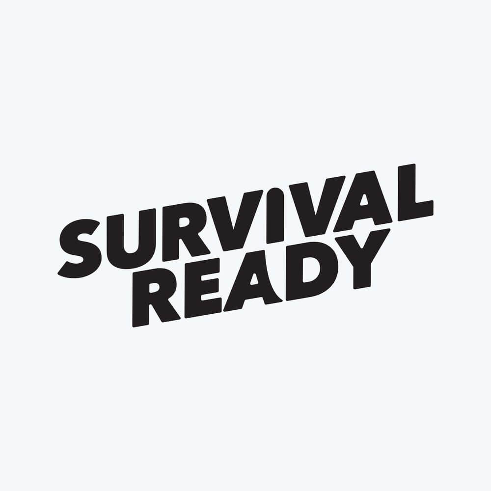
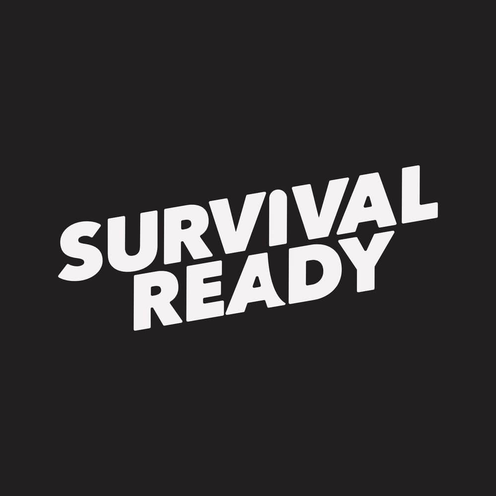
You want to stand out by being remembered and thought of and the association comes from your brand’s Visual Identity—this refers to the logo, fonts, color palette and all the components which represent the brand visually.
When building any Visual Identity, we need to identify and dissect who your ideal customer is. Once identified, every part of the design process is done with them in mind.
Problem 1: Target Customer
If you try to appeal to everyone, you appeal to no one. Who is that tip of the spear customer we need to appeal to?
Problem 2: Limited Square Footage
Inventory choices must be meaningful and resonate with a specific type of customer.
Problem 3: User Experience
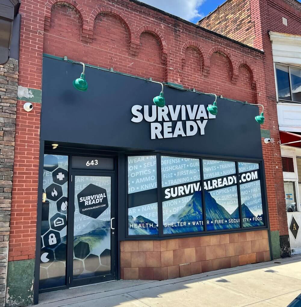
Typical gun and ammo shops are bland with an off-putting with an intimidating experience.
DISCOVERY
Our Discovery Process is built to make sense of the chaos by pinpointing the problem and identifying the opportunities from within.
Competitive Audit
- A crafted visual and interactive view of the competitive landscape including a list of companies who are direct, national, industry adjacent or general inspiration.
Naming
- Our process involves direction through specific categories of naming choices using historical brands as a reference.
Targeting
- Uncovering a specific and defined buyer persona who is a trusted resource with influence within your industry.
Vision & Goals
- Setting long term goals and developing manageable strategies to obtain them via an arsenal of creative services.
Using the data from the Discovery phase, we are able to identify opportunities, trends and directions to focus on as we build the Visual Identity.
DISTILLING THE DISCOVERIES
OPPORTUNITY IDENTIFIED:
Our experience over the past few years compounded with the current state of the world is showing us the reality of just how exposed and vulnerable we may actually be.
What our research uncovered is growing interest in topics such as survival and preparedness.
Coming to the project with a complete outsider’s perspective, we dug deep into the topic learning of a community rich in practical wisdom and education.
Target Audience
Elite Survivalists → Recreationalists → Curious Newcomer
Growing the Survival Ready target audience begins with a focus on Elite Survivalists. Their passion for the outdoors is earned and their understanding of the importance of quality products and materials trickles down as wisdom and guidance from the top to the casual recreationalists and ever-growing curious newcomers.
Visual Identity
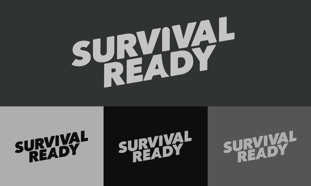
LOGO
FONTS
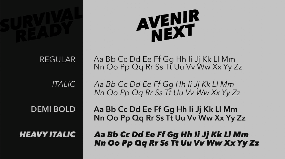
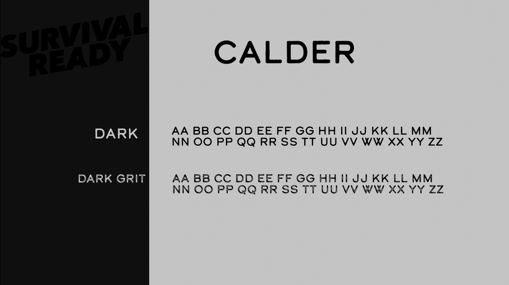
Contrasting these font families covers part of an on going theme we hope to develop. Sleek, simple, and bold when needed, Avenir Next brings an authoritative presence to the brand while Calder offers a gritty and raw realness, a reminder to not underestimate potential circumstances.
COLOR PALETTE
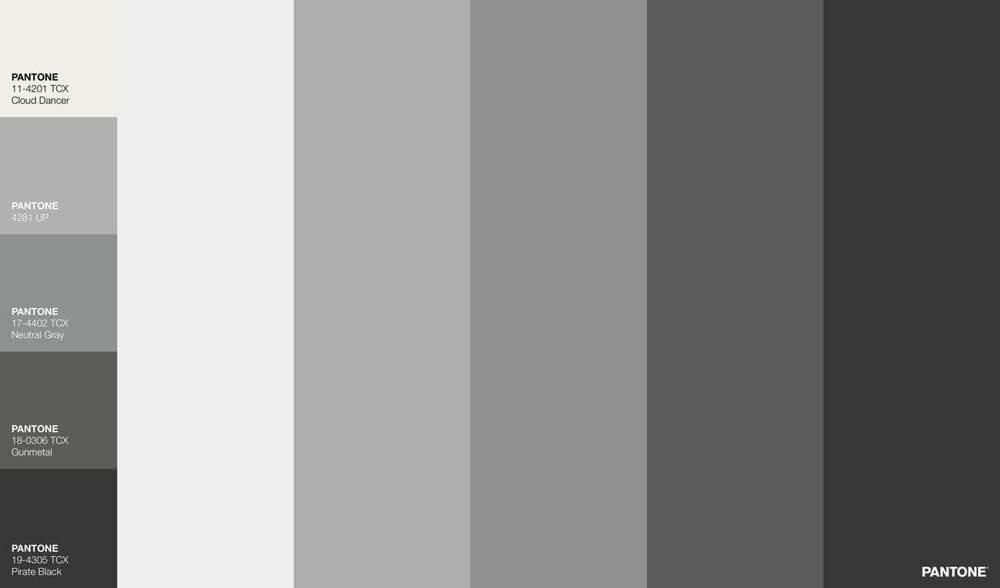
Survival is all about adaptability and this color palette, like its audience, needs the freedom and ability to adapt to its environment.
Building the foundation of the brand on these contrasting dark greys allows for adaptability when creating content surrounding all of our offerings.
BRAND PROMISE
Inspiring conscious preparedness through trusted products and services, classes and insight from industry experts focused on keeping you safe in the face of uncontrollable circumstances.
Being ready for anything, always, takes a practical long term approach to education and accumulation.
- Health
- Shelter
- Water
- Fire
- Security
- Food
BRAND CHARACTER
Respect(ed)ful
- Earned the right of passage who shares knowledge and wisdom
Authentic
- Open and inviting, genuinely interested in building a community
Practical
- Get done what needs done
Durable
- Quality built to endure because it matters
Devoted
- Passionately dedicated and focused
Communal
- Through the strength of a communities we’ve survived until this point
BRAND ARCHETYPE
The Hero & The Creator – Mastery and Innovation
We’ve designated in this specific order as the Master should always innovate. The foundational skills and knowledge about survival are obtainable and can be mastered.
This brand intends to help curious newcomers by providing access to foundational knowledge while providing a platform for the Elite Survivalists to innovate.
CREDITS
- Survival Ready
- Nate Swierkosz
- Shane Potter
- Russ Paras
- Pat Hanavan
- Graceful Hammer Customs
- Carpenters
- Super Deep Creative
- Pat Hanavan
- Mike Minnock
- Nick Prezioso
- A. B.’s Odds & Ends
- Adam Brailey
- American Creative Consulting
- Bud Adams
- Starr / Octane Customs
- Ed Cassele
- Jesse Octane
- LEDs
- Don Jilla
- Nick Prezioso
COMPLEX PROBLEMS REQUIRE CREATIVE SOLUTIONS
